 Think back to elementary school. Remember picture books? Not only were they fun, but also, they provided an effective way for kids to learn.
Studies have shown that visuals – whether photos, videos or infographics – help students learn. But visuals aren’t only for students.
Would you rather read thousands of words on a page or watch a one-minute video?
Visuals are critical to adult learning and good design enhances information retention and increases engagement, according to SHIFT e-learning. A guide by SHIFT gives some tips for designing e-learning curriculum with visuals.
The e-learning company suggests asking the following question: How can you use visuals to explain the content you’d normally write out as a screen filled with bullet points?
“Although content matters a lot, how your learners perceive the instructional content is more often than not dependent on the design element,” SHIFT says. “Learners ignore cluttered and boring design. They gravitate, instead, to one that’s aesthetically pleasing.”
At the heart of good design is communication. Instructional designers should ask themselves, “What problem am I trying to solve and what messages am I trying to communicate?”
Identify the goal of e-learning: Is it to educate or change a behavior? Choosing the right visual will help drive the goal.
At the same time, it’s important to make a good first impression. While content is important, it will be obsolete if a clunky, not-well-thought-out design is the first thing learners see.
So, what’s the key to designing eye-catching and effective content?
It’s CRAP. (Ironically, the acronym is opposite from what designers want.)
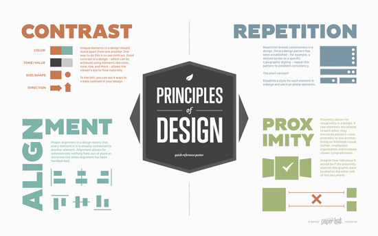
CRAP – Contrast, Repetition, Alignment, Proximity
As part of its guide, SHIFT provides downloadable fliers for a quick reference.
SHIFT suggests the best visuals for incorporating into design:
- Photos
- Illustrations and icons
- Charts and graphs
- Screen grabs
- Characters
- GIFs
- Infographics
- Short videos
SHIFT also lists habits of good designers. Among them: Be fearless. Don’t be afraid to think out of the box (no pun intended).
“Even the greatest creative geniuses of our times don’t get it right the first time,” SHIFT says. “Apple didn’t perfect the design of their notebooks until they had experimented with several prototypes. Result-centric creative people design, iterate, experiment and design more.”
So, instruction designers – never give up!


