Photo Credit: Canva.com
I love name badges. Seriously. Although, let me clarify. I love designing, managing and printing name badges. I don’t always like to WEAR them, but let me at your registration data and I am in one of my happy places!
So far, it’s pretty few and far between where the registration software an association uses can effectively print the name badges as needed. It’s laughable, really. Seems like this would be a fairly basic function of any registration software.
Oh, well, it IS a basic function but that’s the issue. It’s just TOO basic usually. So we then turn to colored stock, various shades of holders, different colored lanyards, a wall of ribbons, stickers, buttons and more to enhance, differentiate and display all the 1,000 things we want to show on our badge.
So how do you decide what goes on a badge during printing or post-production? Let’s explore some of the common things we tend to see...and then I’ll toss a few others in there to consider in the process.
NAME: Unless you’ve gotten to the point where you simply lump attendees by company name, a person’s name is the sweetest thing for them to hear. Make it big. Make it clear. Make it bold. Don’t get fancy here. I want to read it from across the room as we approach each other. I do NOT want to guess at what letters I’m looking at or stare at a person’s chest as they approach. A quick glance from a decent distance should be all I need to pretend like I remember your name. It’s a simple thing that makes ME and YOU both feel good when we can use each other’s names. And to be fair, only the FIRST name is important here. It’s a good thing to include the last name for registration, identification, and all sorts of other reasons, but it can be much much smaller. Also? Best practice during registration is to ask what someone wants as their “first name” on the badge. This allows people that are registering with formal names to use an alternative name. Because if I have to use my legal name (Kathleen) to register and you actually print that on my badge, I will know exactly who doesn’t truly know me because they’ll actually call me Kathleen! Understandable, this adds another layer to data cleanup but it goes a long way in respecting your attendees.
TITLE: Really really think about if this is needed. It is very much dependent on the type of event you have, the interactions taking place, and if there’s value associated with titles. That can work for or against you though, so be cautious here. You might even determine titles are needed for attendees, but not for exhibitors, or the other way around. A person’s title on their badge could cut off a conversation before it even starts. Omitting this means you have to engage with others to learn more about what they do and what their role in your industry is. Forced networking.
ORGANIZATION: I could simply repeat the above paragraph here. But more often, organization carries more weight than title. Again, it depends on your event and the type of event. It is most helpful in making connections and starting a conversation between either attendees or exhibitors. But what about people that are contractors, self-employed, unemployed, retired, a student, etc... Do they get to put something else there? Don’t forget about them! Some events exclude this to aid in networking just as title does. If all I see is your first name, I am forced to exchange some information with you and thus, networking is built into the basic “Hello My Name is” badge that just screams your first name.
MEMBERSHIP STATUS/TIER: For some events, membership admits attendees to sessions that non-members cannot get into, so identifying membership status and/or type and/or tier may be critical to crowd management. If you are scanning people into rooms though, that information may easily be stored in the QR code and might NOT be useful on the badge. Think through whether interactions between attendees and exhibitors is helped or hindered by this information. Consider what it’s being used for, why, and if it’s necessary. Many organizations will turn to ribbons or card stock or badge holders or lanyard colors to differentiate membership as well - all viable options. Or just print a symbol or logo on those badges where membership applies. And if everyone at the event is a member, then there definitely is no need to print that or give them a ribbon for it!
LOGO / CONFERENCE NAME / CONFERENCE DATE: Lumping all these together here. Think about what you NEED on the badge. Remember, we’re already AT the event. We know the company running the event. And hopefully we have a rough idea of what day it is. Small venue? Only group? If you must put the logo on, make it small and minimalist. If you’re at a large venue with multiple groups, a prominent graphic (event sponsor or event logo) will help everyone at the various doors admit only those that should be admitted. It’s definitely a place to be on point with branding, but the size it takes up is determined by how necessary it is given the environment.
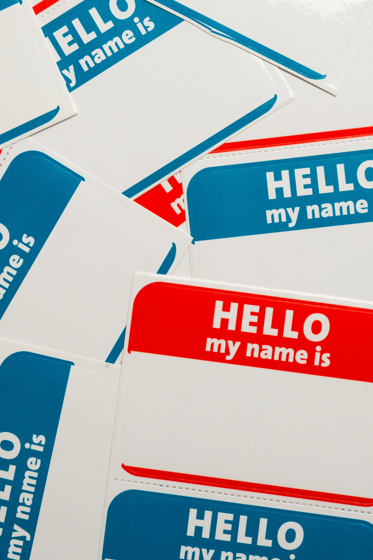
I think that’s enough for you to think about for now... Are you ready to go back to just handing out “Hello My Name Is” stickers yet?? That would take all the fun out of prepping, printing, tearing, stuffing and setting up namebadges though...
Part 2 will focus on distinguishing registration types, leaving space for pronouns, professional certifications, talking points and QR codes / barcodes.
Part 3 - we’re going to flip that badge over and talk about the backside!